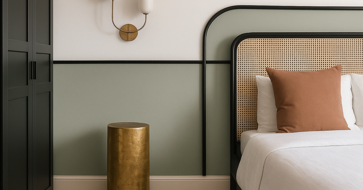
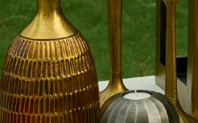
In the shifting landscape of modern interiors, where homes are designed to support emotional wellness as much as aesthetic beauty, colour blocking for homes has taken on new meaning. Once defined by contrast, it now finds power in subtlety, blending grounded, neutral foundations with high-impact accents to cultivate spaces that are expressive, yet composed. This evolution mirrors a broader cultural shift: toward interiors that are emotionally intelligent, materially conscious, and fundamentally personal.
At the forefront of this philosophy is Taho Living, a sculptural furniture studio in India. With a practice rooted in permanence, material honesty, and form-led restraint, Taho redefines what boldness looks like. Their pieces, formed in cast brass, stone, and hand-finished metal—don’t clamor for attention. They hold it. And in doing so, they provide the perfect framework for a more nuanced, elevated take on interior design.
The Psychology of Colour in Home Design
Design psychology underscores the importance of colour in shaping how we experience space. According to Jaglarz (2023), intentional colour harmonies help regulate mood and perception, stimulating the mind while preserving clarity. Research by Yildirim et al. (2011) further emphasizes that rich hues, ochre, deep green, rust, can energize a room, while muted neutrals, like ash, limestone, or ivory, promote stillness and ease.
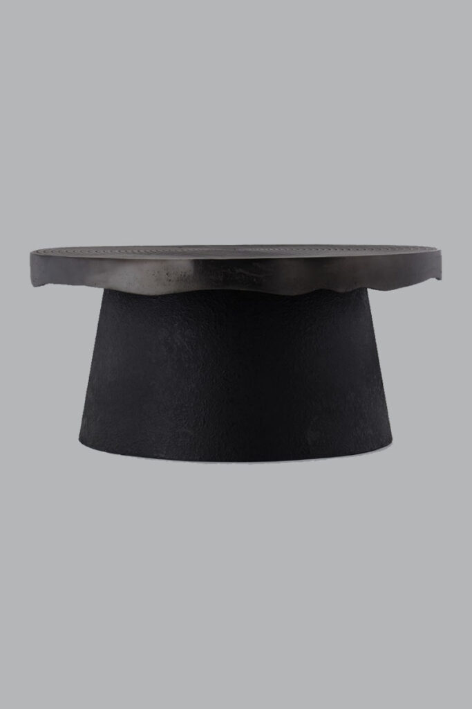
Taho’s Terra Coffee Table captures this duality with poetic restraint. Its monolithic form and earthy metal patina exude calm, while its raw texture and material depth lend visual intensity. It anchors the room, allowing expressive elements, like a sculptural art piece or vibrant upholstered lounge, to orbit around it without overwhelming the senses.
Design in Harmony: Tuning Interiors with the 60–30–10 Rule
One of the most effective approaches to colour blocking in interiors is the 60–30–10 ratio: 60% of the space is dedicated to muted base tones, 30% to transitional hues (like pale wood, bronze, or soft clay), and 10% to bold, concentrated colour.
Taho’s Sadie Coffee Table, with its brushed aluminum finish and stepped cylindrical base, lives effortlessly in that 30% zone. Paired with a deep blue sofa or ochre-toned rug, it provides tonal structure without becoming visually rigid. It is contemporary, but timeless, able to move through design evolutions without losing relevance.
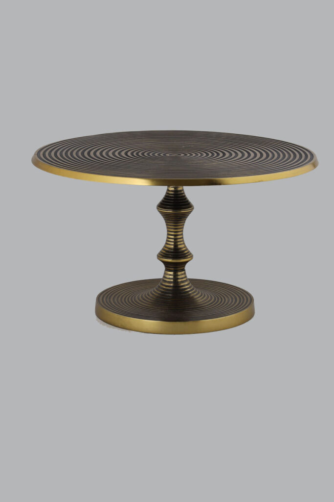
And for the final 10%, the accent? A bold artwork, a rust-toned linen cushion, or a statement object placed atop the Terra Side Table, which reflects light and shadow through its antique brass surface. This isn’t just furniture, it’s orchestration.
Texture Speaks: When Materials Become Your Colour Palette
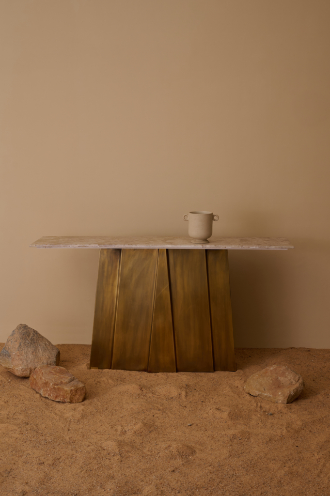
In Taho’s world, colour emerges through patina, oxidation, and raw finish, not through applied pigment. Their approach to materiality is tactile and enduring, rendering even neutral tones expressive. The Dwar Console Table blends a structured brass form with a travertine top, offering a pale, veined texture that references temple plinths and architectural stillness. It’s a piece that adapts seamlessly to colour-forward surroundings while standing dignified on its own.
In this new wave of sustainable home design, it’s not only about how pieces look, but how they age. Taho finishes are unsealed, left to patinate, and designed to evolve alongside their environment, inviting homeowners to layer seasonal colour around a consistent, sculptural core.
Earth Tones: The Emotional Weight of Natural Hues
Biophilic design, a practice that connects architecture with nature, often relies on colour to bring the outside in. Earthy hues like clay, bark, moss, and terracotta don’t just evoke natural landscapes; they also have a grounding effect on mood (McGee, 2021). In this way, bold colours in interiors take on a new responsibility: not to impress, but to restore.
The Ambry Console Table, finished in hand-burnished black, becomes the perfect counterpoint to a stonewashed linen wall or a forest-green velvet bench. Its silhouette is quiet, but its presence is pronounced. It creates contrast not just in tone, but in texture and intention, a hallmark of biophilic, emotionally attuned design.
Sculptural Punctuation: Using Accent Furniture as a Colour Statement
Not every bold gesture requires a painted wall. In fact, one of the most sophisticated ways to explore colour in interiors is through bold accent furniture, pieces that offer punctuation, not disruption.
In the Taho universe, accent pieces are less about trend and more about tension. The Terra Side Table, when paired with a textured rug or a wall in deep ochre or slate, becomes a sculptural pause. It speaks softly but clearly. And unlike transient colour trends, these accents can evolve with the space, offering longevity without visual fatigue.
Timeless by Design: The Sustainability of Thoughtful Colour Use
The beauty of this new colour-blocking language is its alignment with sustainability. When we root our interiors in timeless materials and let colour accents be flexible, we reduce the need for constant overhaul. Taho’s pieces, like the Sadie, Terra, Ambry, and Dwar, are designed not just to last physically, but aesthetically. Their forms are archetypal, their materials ageless.
This is sustainable home design at its most refined: a home that shifts seasonally in tone and texture, while remaining grounded in enduring design.
Quiet Boldness: When Colour Becomes Architecture
Muted doesn’t mean minimal. Bold doesn’t mean loud. The emerging language of colour in interiors is one of balance, between stillness and strength, permanence and play. It’s a language Taho speaks fluently, through furniture that doesn’t just fill space but defines it. In their sculptural forms and raw textures, muted foundations meet bold accents to create interiors that are not only beautiful, but deeply intentional.
Here, colour becomes part of the architecture, layered, lived, and quietly bold.


